Project Overview
OxeFit’s First Design System: Built for Scaling, Speed, and Consistency Across iOS, Android, Smart Devices (XS1, XP1), and Web — Powered by Tokens, Variables, and Modular Design
As the sole designer, I was responsible for redesigning the mobile app during its transition to fully native iOS and Android. The timeline was tight, platform inconsistencies were high, and there was no existing system or guidelines to rely on. I secured leadership buy-in to build a design system that would allow me to design screens once, iterate quickly, and maintain consistency across mobile, smart devices, and web.
Team
Myself, VP of Software Development, Senior IOS Developer, Senior Android Developer, Senior Angular Developer, 2 Unity developers
Role
Lead UX/UI Designer
Objectives
Design Once, Use Everywhere
Design screens once and adapt them across platforms using tokens, variables, and modular components — reducing redundant work.
Promote Consistency at Scale
Unify visual language and component behavior across iOS, Android, smart gym interfaces (XS1, XP1), and web.
Improve Efficiency of Iterative Workflow
Support rapid iteration cycles by building reusable templates and atomic components that scale efficiently as the product evolves.
Create a Developer-Ready Foundation
Provide engineering teams with a tokenized, implementation-friendly system that works across mobile, Unity, and Angular stacks.
Strategy & Planning
After Defining Our Objectives, I Moved Into Strategizing and Architecting a System
Once I had a clear understanding of our goals and what success looked like, I began strategizing and building a system architecture designed to meet those objectives and address our platform challenges.
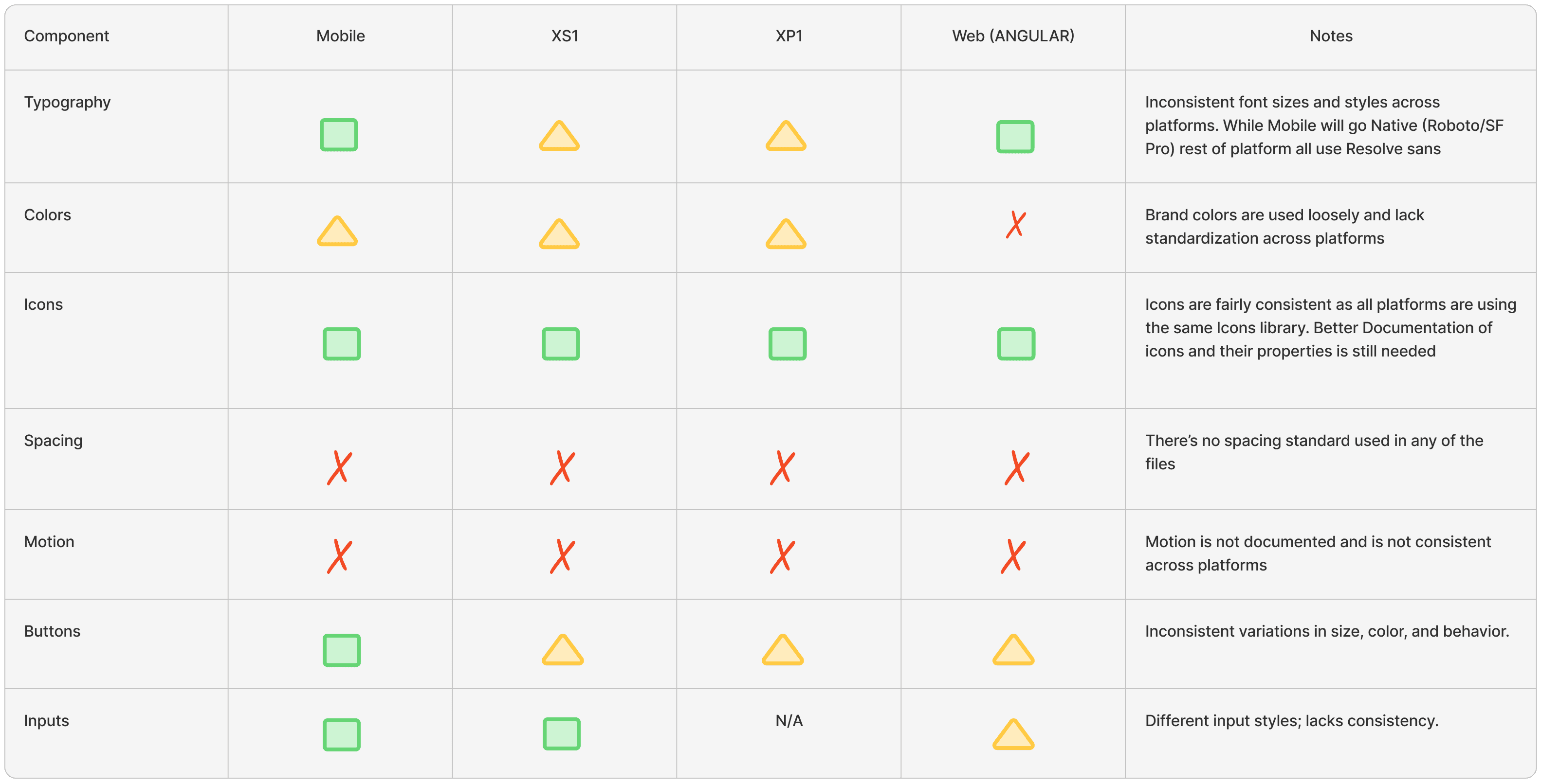
The existing designs had no structure — so I conducted a full audit to map out what needed rebuilding
the existing designs were just static screens — no components, tokens, or structure. Everything was manually styled, inconsistent, and disconnected across platforms. There was no system to build on, so I began with a full audit to plan how to rebuild one.
Planned a modular and flexible system prioritizing speed of iteration, consistency, cross-platform adaptability, and low management overhead
After completing the audit, it was clear the system needed to support rapid iteration while adapting to the needs of multiple platforms. But just as important, it needed to stay flexible. The company and product were still evolving, and a rigid system would have created friction — locking in design decisions too early and limiting creative exploration.
System Implementation
Once the System Plan Was in Place, I Moved Into Building the Structure, Components, and Platform-Specific Libraries
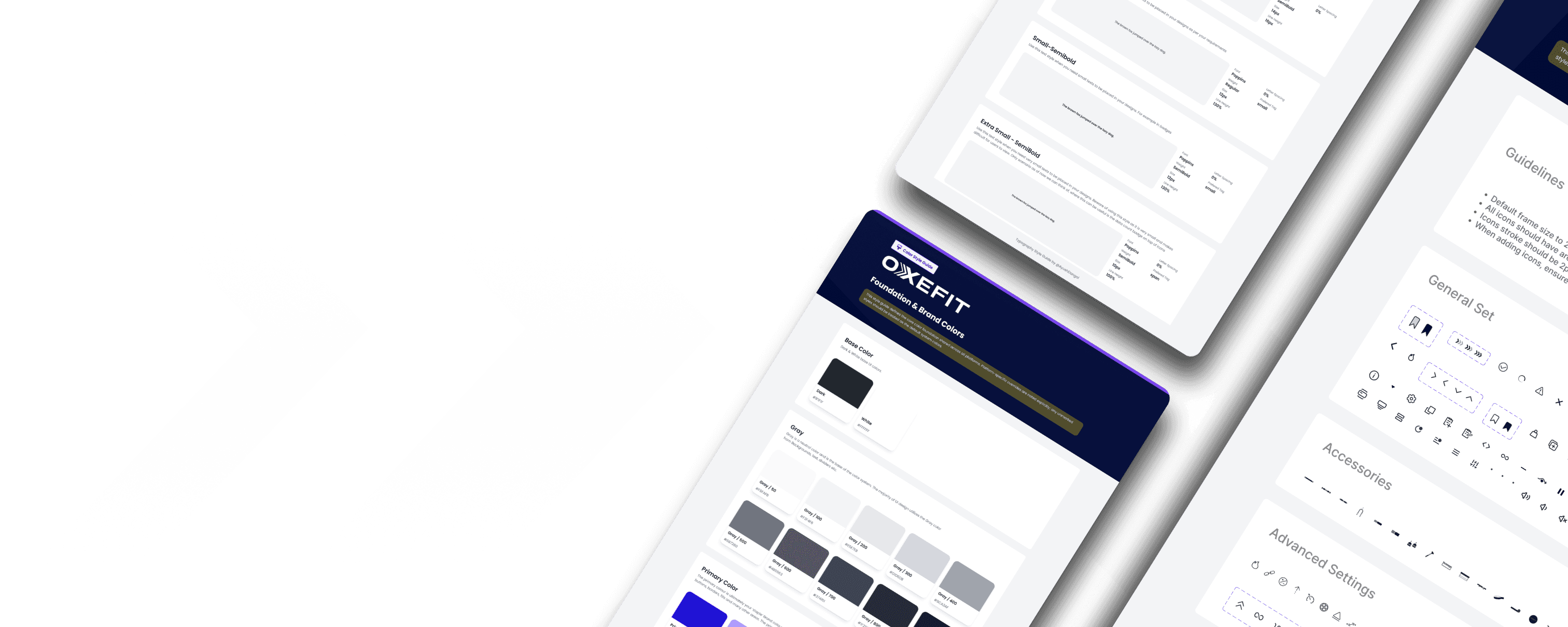
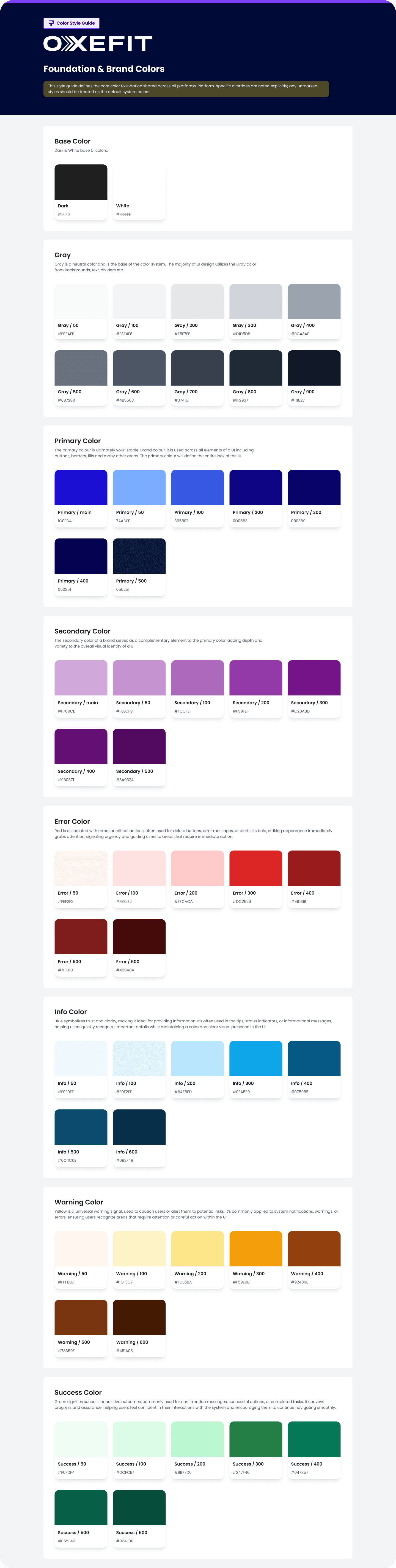
Established the core library and documented foundational elements like icons, color styles, and typography guidelines
I started by building a structured core library that housed all foundational styles — including colors, typography, spacing, icon sets, and basic components like buttons. I documented usage guidelines for each, helping ensure consistency from the start

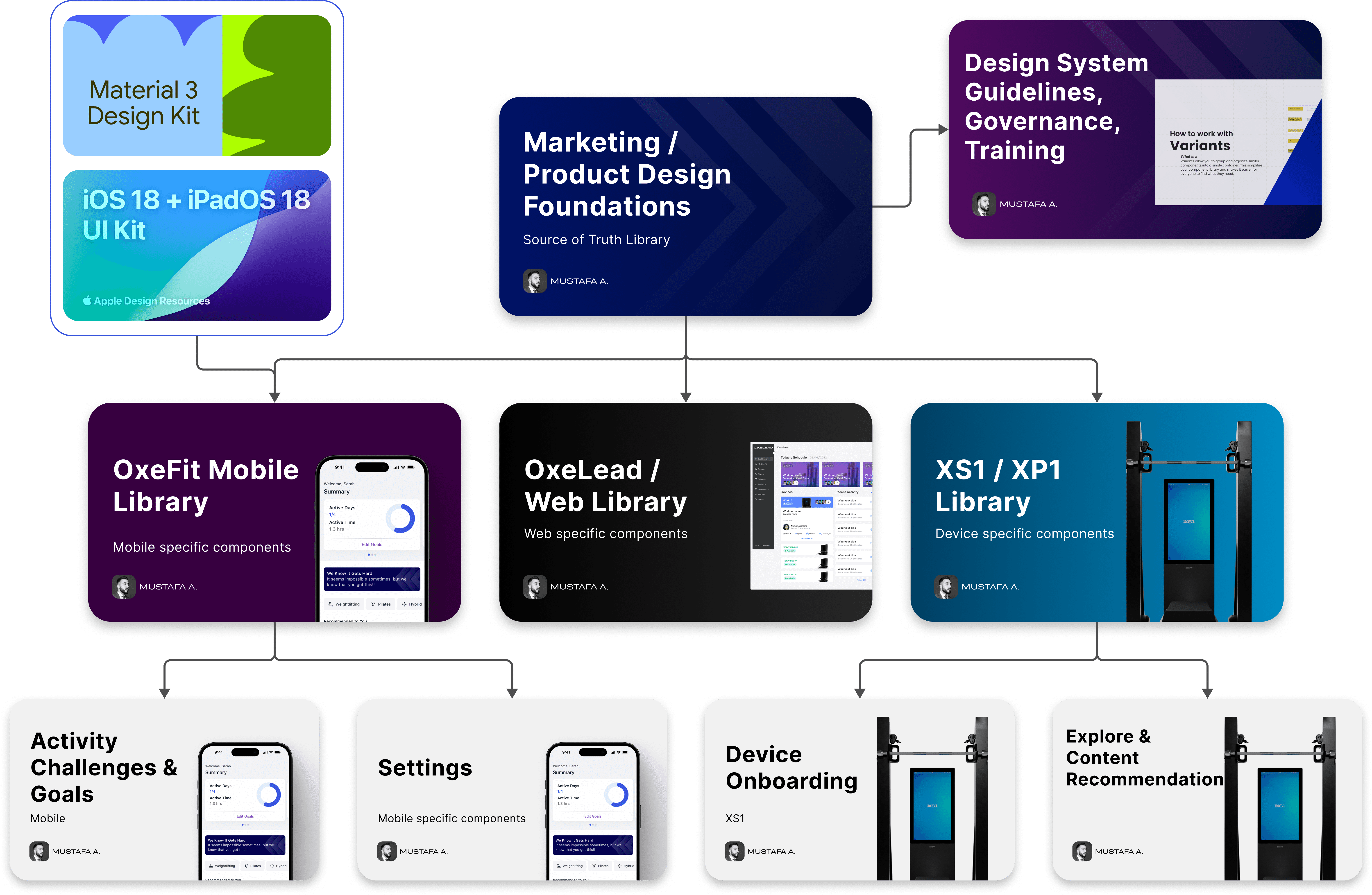
Extended the system from the shared core library into platform-specific libraries to support native UX and maintain consistency
Once the core library was built, I extended it into platform-specific libraries for iOS, Android, Web, and our smart devices (XS1 and XP1). Each one inherited foundational tokens and components, with nested elements used to adapt platform-specific parts like headers or layout behaviors — allowing shared structure with minimal duplication.
Established variable libraries leveraging modes to switch sizing, typography, and other platform-specific components without duplicating work
To streamline platform-specific design, I set up variable libraries for spacing, typography, and native components. With Figma Modes, I could toggle between iOS and Android in a single file — automatically updating headers, type styles, and layout. This let me design once, maintain native UX, and avoid duplicating work across platforms.

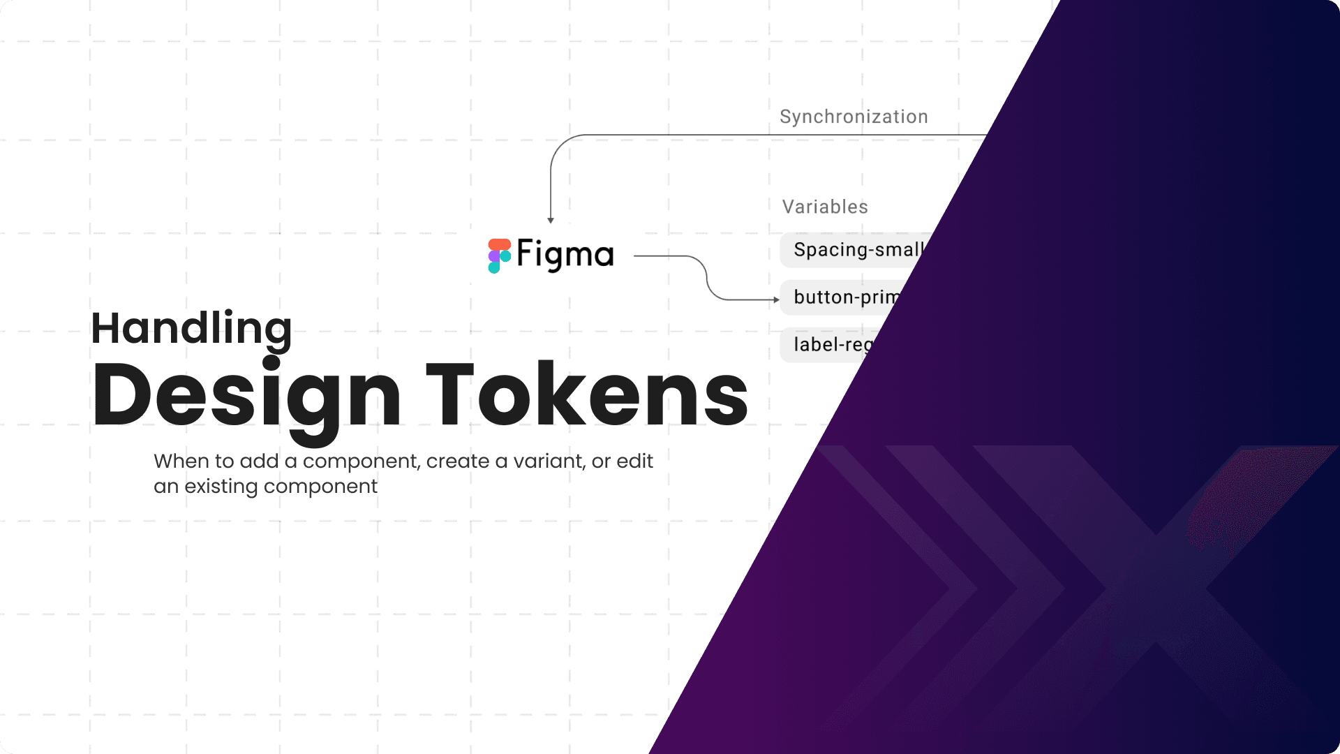
Defined a scalable token system to drive consistency and prepare for development integration
To support consistency and ease of maintenance, I created a token system covering color, typography, spacing, and radius. These tokens were used across the entire design system to standardize styling and reduce manual overrides. I also worked with mobile engineers to begin syncing design tokens with the iOS and Android codebases, setting the foundation for future expansion into Unity and Angular.
System Maintenance & Documentation
Making the System Sustainable, Scalable, and Easy to Adopt
I prioritized making the system able to stand on its own — built to support long-term growth, be easily adopted by new team members, and scale with the company. I focused on documentation, structure, and processes that would make onboarding easy and help future designers and developers understand, use, and evolve the system confidently.
Designed to stay clean and scalable without constant upkeep — and easy for others to contribute without breaking it
I structured the system to be lean, modular, and easy to maintain without constant redesign or cleanup. By using tokens, nested components, and a consistent naming convention, I kept the design logic simple and scalable. I also introduced lightweight contribution guidelines to help future designers and developers understand when to reuse, modify, or create new components — making collaboration smoother and the system more resilient over time.
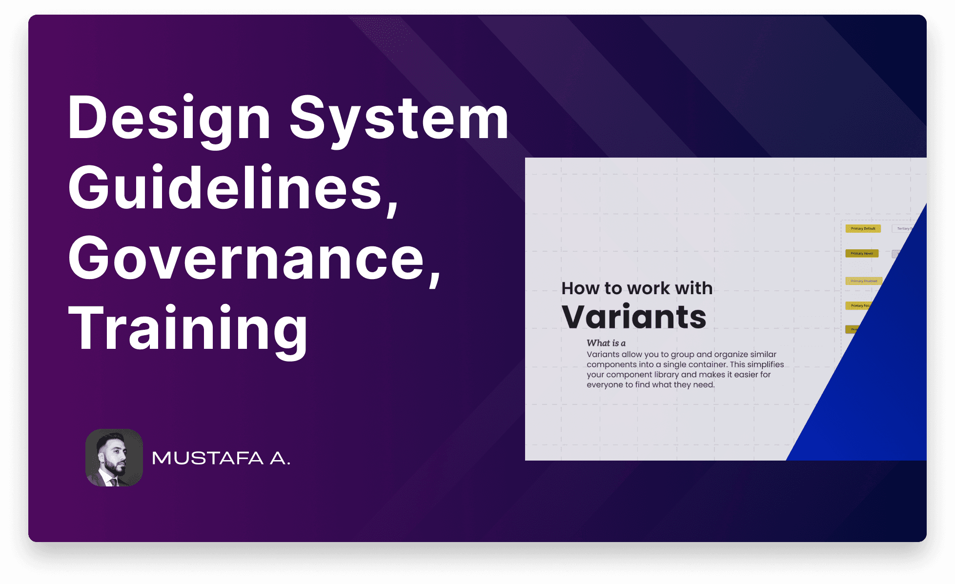
Created training slides and documentation to guide designers and developers in using and maintaining the system — and to streamline onboarding
To support ongoing use and make onboarding easier, I created training slides and documentation that clearly explain how the system works. They cover everything from foundational styles and tokens to component structure, platform-specific logic, and contribution workflows. These materials help both designers and developers get up to speed quickly, use the system correctly, and maintain it without relying on handoffs or tribal knowledge.

Outcome & Reflection
Reflecting on the System’s Impact
The implementation of OxeFit’s first design system brought immediate, measurable improvements across the product and team:
1. Consistency and brand alignment:
The shared system ensured a cohesive user experience across iOS, Android, smart devices, and web — aligning previously disconnected UI patterns under one visual language.
2. Improved efficiency:
Designing once and switching between platforms using variables and shared components significantly reduced design time and rework.
3. Less ambiguity, more clarity:
With clearly defined foundations and workflows, the system made decisions easier and design more focused — freeing up time for actual problem solving instead of debating styles.
4. Enhanced collaboration:
The system gave engineers a clear structure to build from, reducing handoff friction and enabling faster implementation across mobile and device teams.
5. Scalable by design:
The shared system ensured a cohesive user experience across iOS, Android, smart devices, and web — aligning previously disconnected UI patterns under one visual language.
Personal Reflection:
This project pushed me to design not just for users, but for the team behind the product. I had to think like a builder, a maintainer, and a future teammate — all at once. It taught me how to think in systems, how to simplify what matters, and how to create something that lasts, even when roles change.
Thanks for reading — I hope this gave you a clear look into my thinking, process, and impact.
I'm always excited to solve meaningful problems through thoughtful design. If you'd like to chat or collaborate, feel free to reach out.

OxeAI: Adaptive Coaching
A behavior-driven coaching system that evolves with users— built to make them care enough to come back.
End-to- End Design
B2C
B2B
Behavioral Design
Design System