

Project Overview
Designing for the Unknown: How I Led the End-to-End Product Design of OxeAI, OxeFit's Adaptive AI Coach.
In this case study, I walk through how I led UX and product design to build an AI-powered fitness coach from the ground up — translating a shifting vision into a clear, scalable experience across mobile and smart fitness devices
Responsibilities
Product Strategy • UX Strategy • UX Design • UI Design • Cross-Platform Flows • Sub-Brand Guidelines • Design System (Multi-Platform) • Stakeholder Management • Visual Direction
Team
Senior Cloud Engineer, VP of Software Development, Senior IOS Developer, Senior Android Developer, CTO (As Project Manager)
Role
Design Lead
Time frame
0-1 in 12 Weeks
Project Summary
With so much to share about this project, here’s a quick summary — in case you’re short on time (aren’t we all?).
Product Vision
This project started with the vision of creating an AI feature that generates 4-week fitness programs for OxeFit's XS1 and XP1 (smart fitness equipment) users. The program would adapt to users' performance and needs as they progress.
Objectives
Build Long-Term User Engagement
and Retention to Our Devices.
Our main objective is to build long-term engagement with our smart fitness devices (XS1 and XP1), leading to higher long-term retention rates.
Communicate Tangible Value to Justify Ongoing Membership.
Our second objective was to justify OxeFit’s membership by leveraging user data to showcase tangible value through clear progress and personalized, adaptive experiences—reinforcing the benefits of continued use and supporting our core goal of long-term retention.
Key Challenges
Multi-Platform Inconsistencies
Each platform had a different style guide and tech stack, making it difficult to create a unified experience. The mobile app had the most up-to-date system, while XS1 and XP1 were outdated.
Implementation Constraints
We had limited engineering bandwidth and tight deadlines, which forced us to constantly balance ideal UX with what was feasible to build in the short term.
Shifting Leadership Vision
The CEO’s evolving vision forced multiple design pivots — most notably:
Moving from a rigid 4-week “program” model to a more fluid, continuous, week-by-week structure.
Simplifying the interface drastically to make AI feel “autopilot-like,” removing detailed program views and workout lists from the core UI.
Motivating Behavior Without a Human Coach
Without human accountability, we had to solve for motivation, commitment, and habit formation through product design alone. This included the introduction of features like reminders, progress summaries, and “aha” moments.
Overview of the Final Experience:
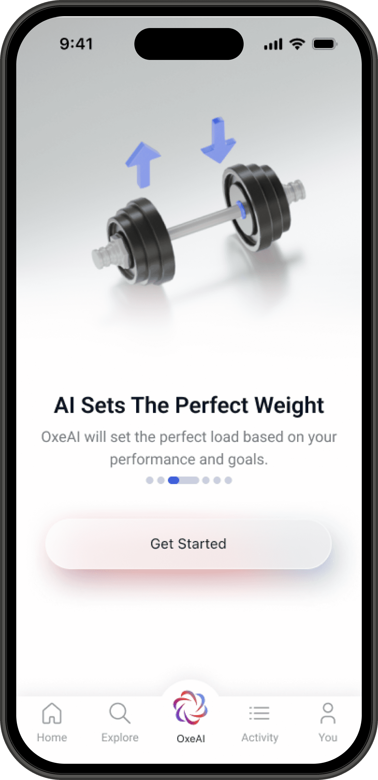

Onboarding — Framing the Value.
A 3D-illustrated onboarding slideshow that introduces users to the core benefits of OxeAI—personalized programs, adaptive coaching, and smart weight selection. This moment sets the tone before users begin.
Feature Adoption
Value Framing
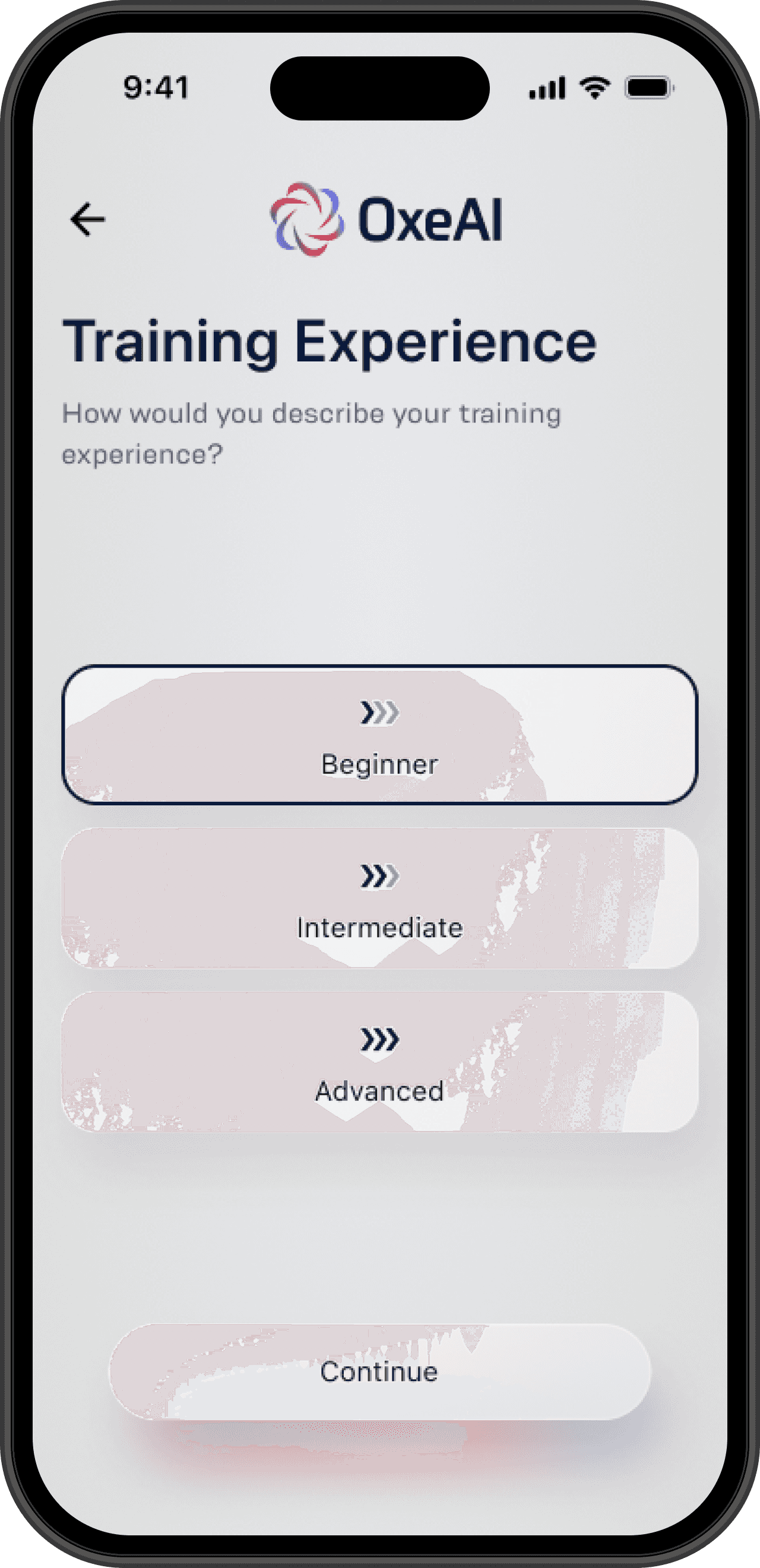
Personalization
Although we already had this data from device onboarding, we re-asked 6 targeted questions to emphasize personalization, align with users’ most current goals, framed OxeAI as adaptive experience, and create a psychological contract—driving retention by showing users that their goals directly shape their experience.
Goal-Driven Retention
Value Framing
Psychological Commitment

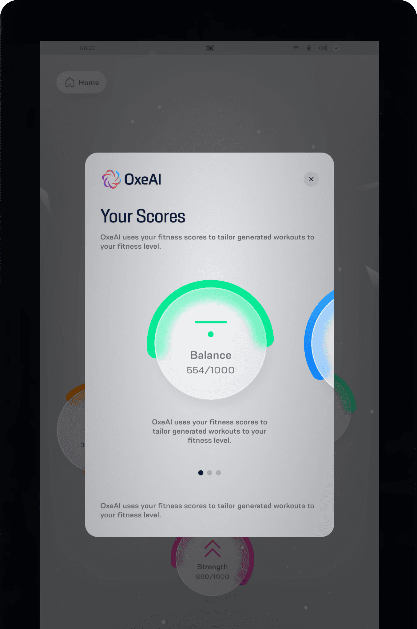
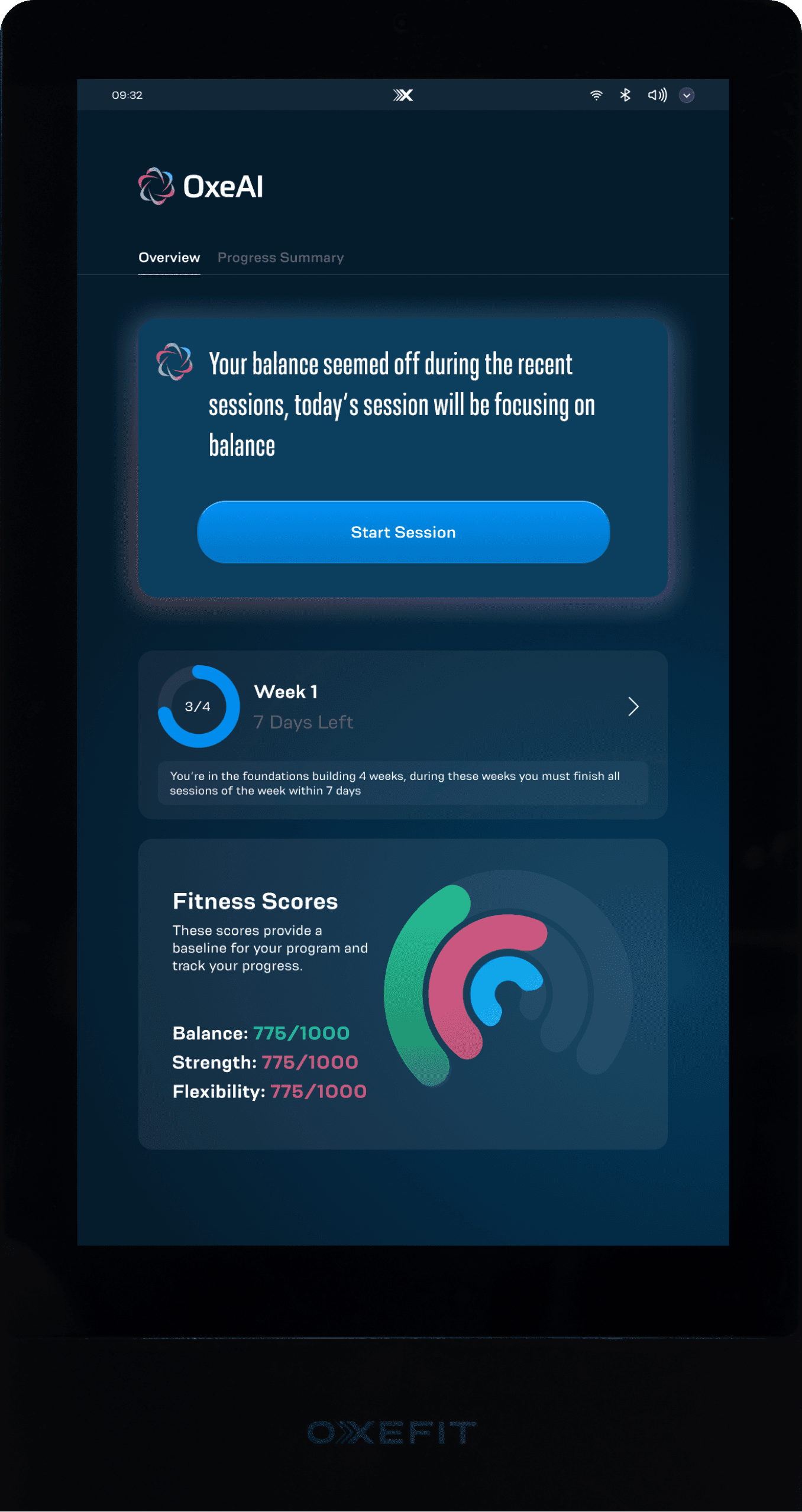
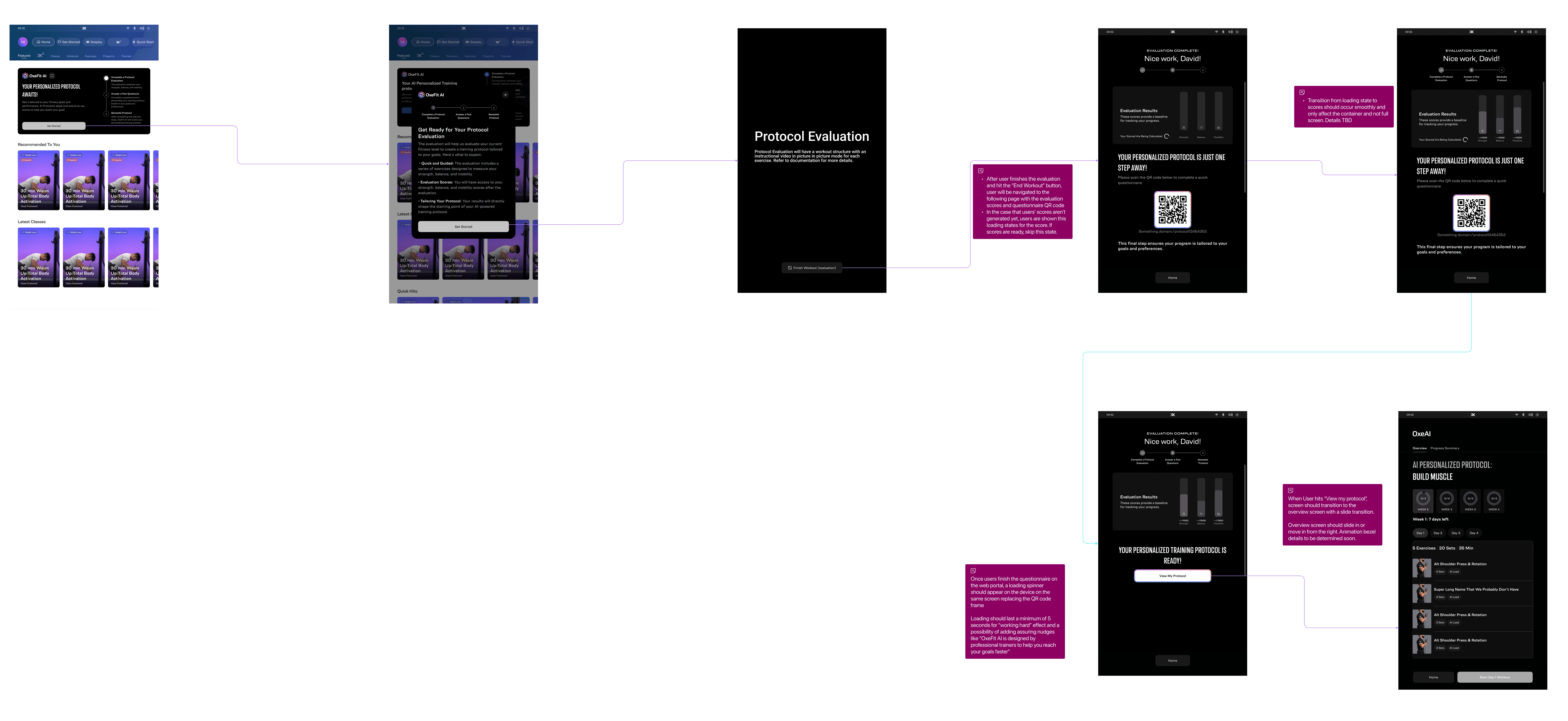
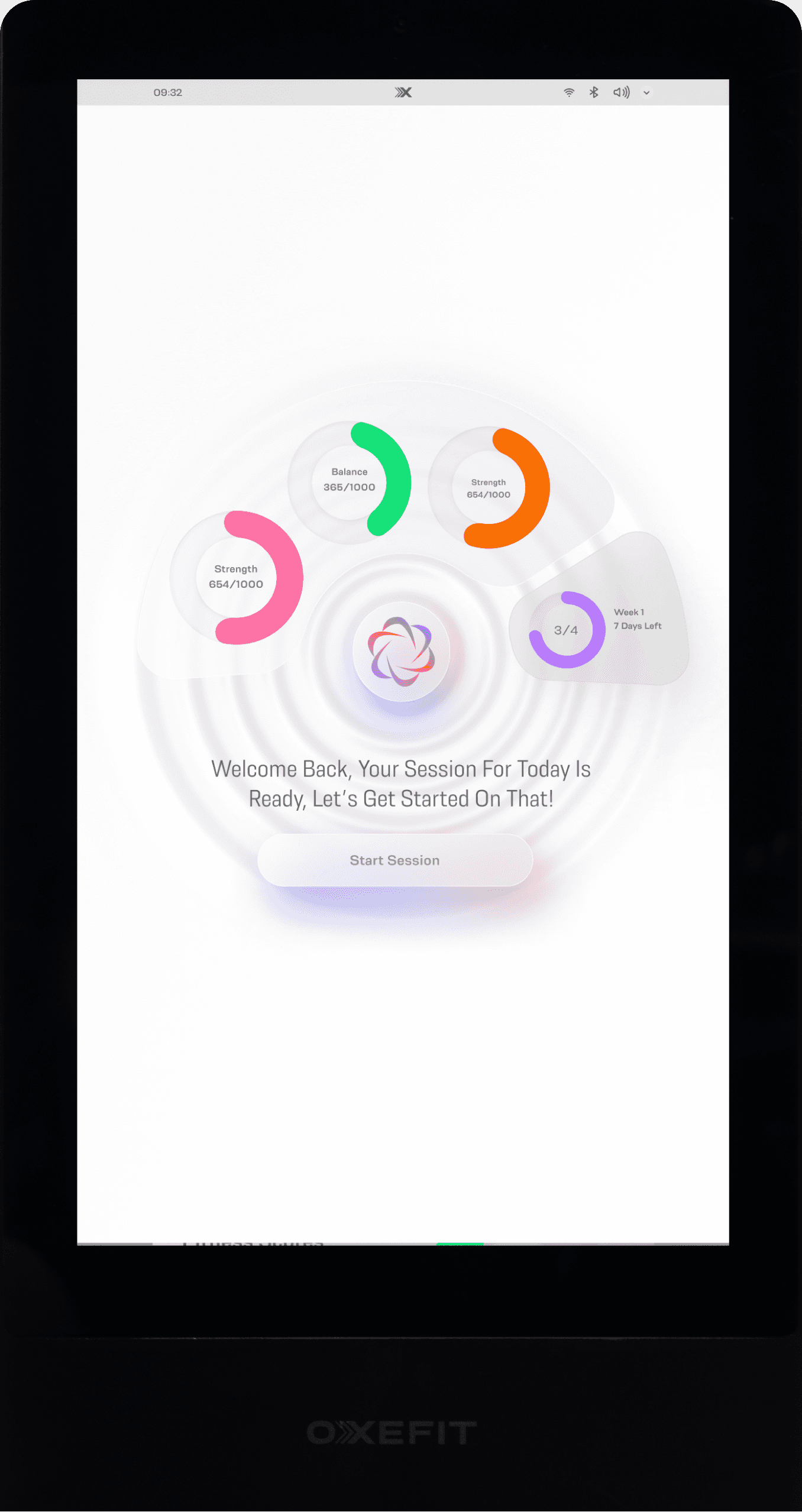
Fitness Evaluation — Building Trust and Tangibility
While we already had this data for most users, prompting them to complete the evaluation built trust in the fitness scores and framed the results as meaningful. These scores made progress feel tangible, driving both engagement and retention—while also making the product feel more approachable and fun for everyday users.
The evaluation scores directly influenced how OxeAI generated the user’s starting workouts—making the AI feel intelligent, responsive, and worth trusting.
Trust Building
Motivation
Progress Visibility
Consumer Appeal
Engagement & Retention
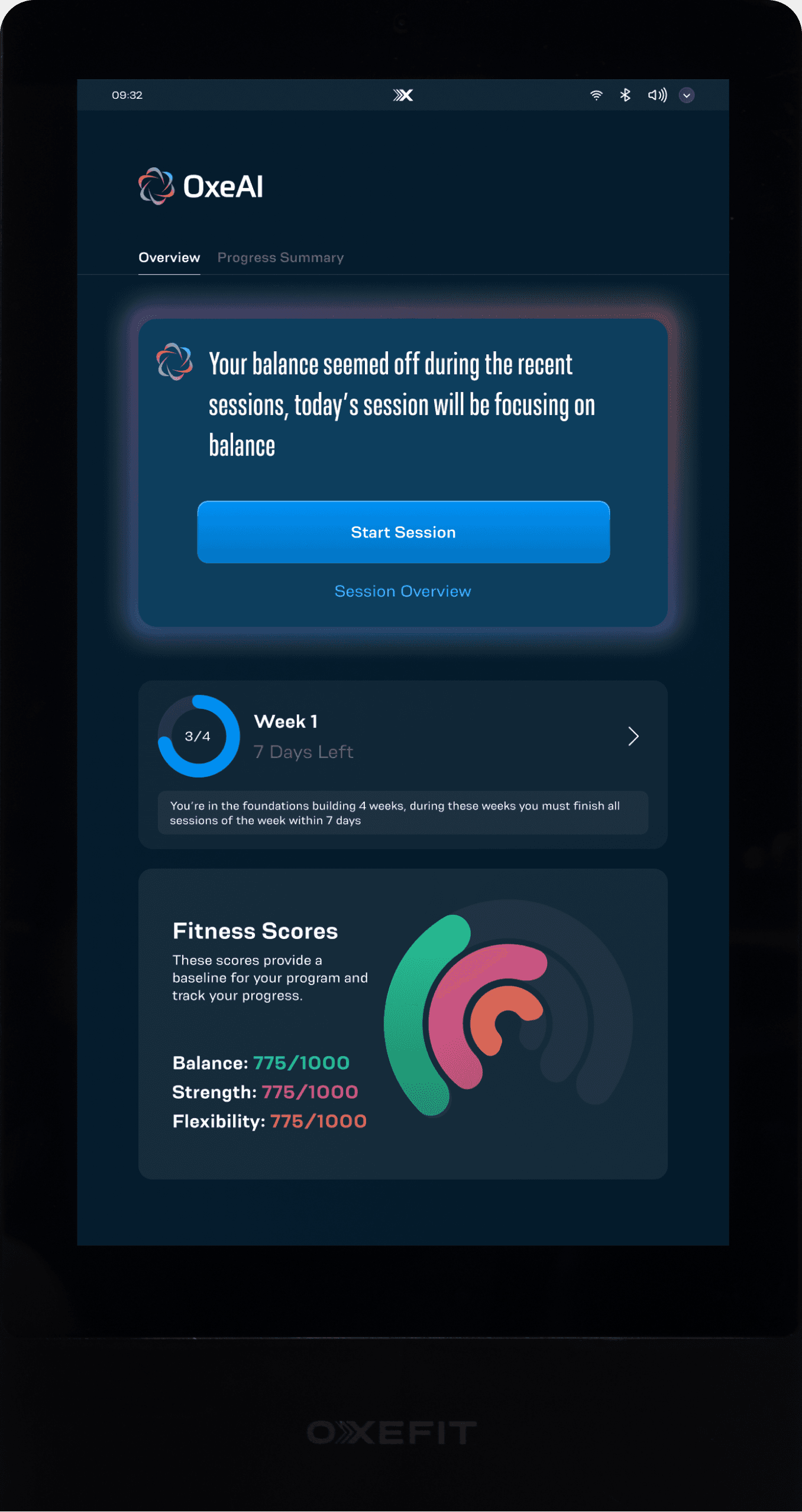
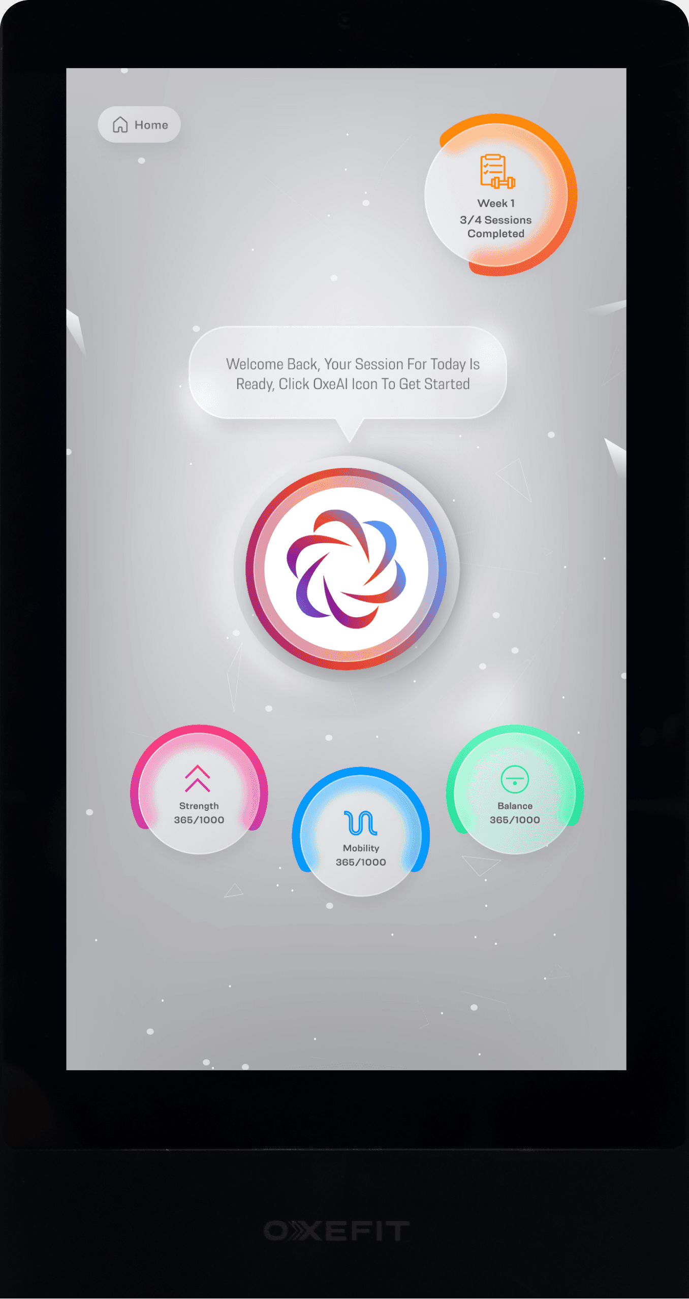
Weekly Summary — Reinforcing OxeAI's Value Through Visible Progress
A concise end-of-week summary that highlights the workouts completed, consistency, and evolving performance trends. It gives users a clear sense of achievement while gently nudging them to continue progressing.
Perceived ROI
Motivation
Value Framing
Progress Visibility
Engagement & Retention

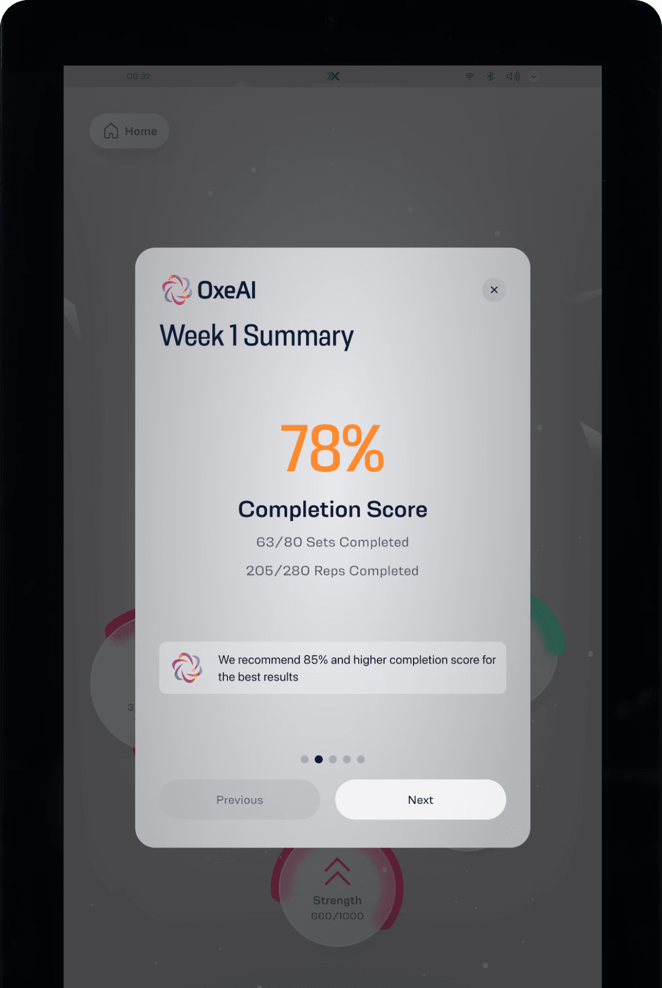
Completion Score — Reinforcing Commitment to Drive Progress and Retention
The Completion Score highlights how consistently users followed their AI-generated protocol—making it clear that progress is tied to their own commitment. This reinforces the value of showing up and creates a loop: commitment leads to fitness progress, which validates the product’s effectiveness. By turning adherence into visible achievement, it boosts motivation and retention through a clear sense of earned progress.
Behavioral Reinforcement
Motivation
Retention
Progress Accountability
Company Background
OxeFit is a fitness and wellness tech startup redefining smart home fitness
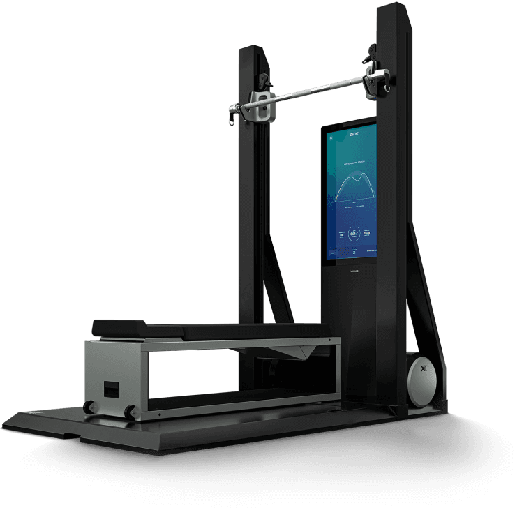
OxeFit develops cutting-edge fitness technology for both consumers and professional environments. Their XS1 system brings immersive, data-driven training into the home, while the XP1 and its supporting SaaS platform deliver advanced strength and rehab solutions to clinics, athletic programs, and performance centers

Shaping the Vision
I Couldn’t Rely on Traditional Research—So I Found Insights Elsewhere
Constraints forced creativity—I used unconventional methods and focused on lean research to find insights and make informed design choices.
I analyzed indirect competitors that offer similar AI services. I reviewed three fitness apps that deliver AI-generated workout programs
None were direct competitors (mostly because they don't offer hardware like OxeFit), but they still offered insight into user expectations around personalization, tracking, and flexibility.

I analyzed 500+ app store reviews from the indirect competitors to extract user needs, frustrations, and wins
This helped me identify recurring pain points like lack of real-time feedback, limited customization, and technical issues. It also surfaced what users love—such as progress tracking and easy-to-follow routines.

I mapped a high-level user journey to visualize gaps and opportunities
This map helped surface friction points like onboarding clarity, AI trust, workout relevance, and motivational dips. This grounded my thinking in actual user behavior, rather than assumption or internal opinions.

Product Strategy
With So Much Riding on Execution, I Led Prioritization and Roadmapping to Define a MVP
Understanding what motivated users—and what got in their way—helped us define what would make or break this product
After collecting insights and aligning with leadership on what success should look like, we started to see the bigger picture. We identified the most impactful focus areas that would drive that success—giving us the clarity we needed to prioritize and roadmap with confidence.
Trust in AI as a Capable Coach
Users needed to believe the AI was accurate, personalized, and smart enough to guide their fitness journey. This required clear logic behind recommendations, and intuitive UX that conveyed intelligence.
Motivation and Momentum
The AI becomes more valuable the longer users stay — as it learns, adjusts, and improves their results. That meant retention wasn’t just a metric, it was a design goal.
Perceived and Experienced Value
Users needed to feel the impact quickly and consistently — whether via visible progress, performance scores, or personalized recommendations.
Adoption and Short-Term Retention
The AI becomes more valuable the longer users stay — as it learns, adjusts, and improves their results. That meant retention wasn’t just a metric, it was a design goal.
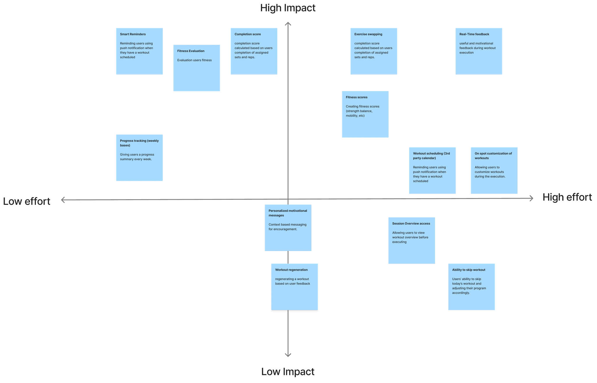
Once we defined success, I facilitated workshops with SMEs and engineers to discuss unknowns, translate them into solutions, and prioritize features
We began by mapping out assumptions and unknowns to surface areas of risk and opportunity. From there, I collaborated with both teams to brainstorm solutions and prioritize features that tackled multiple user and business goals at once and is feasible to implement within our timeline—balancing impact, effort, and strategic value to shape a viable MVP
Turning Strategy Into UX
After Aligning and Getting Buy-In on What We’re Building, I Started Mapping Out How It Should Work
I started by sketching critical flows and concepts that addressed major concerns and surfaced opportunities—so we could test assumptions, collect feedback, and ensure alignment before moving forward
I sketched Lo-Fi wireframes using existing components to explore the features that we prioritized, test concepts, and collect leadership feedback.
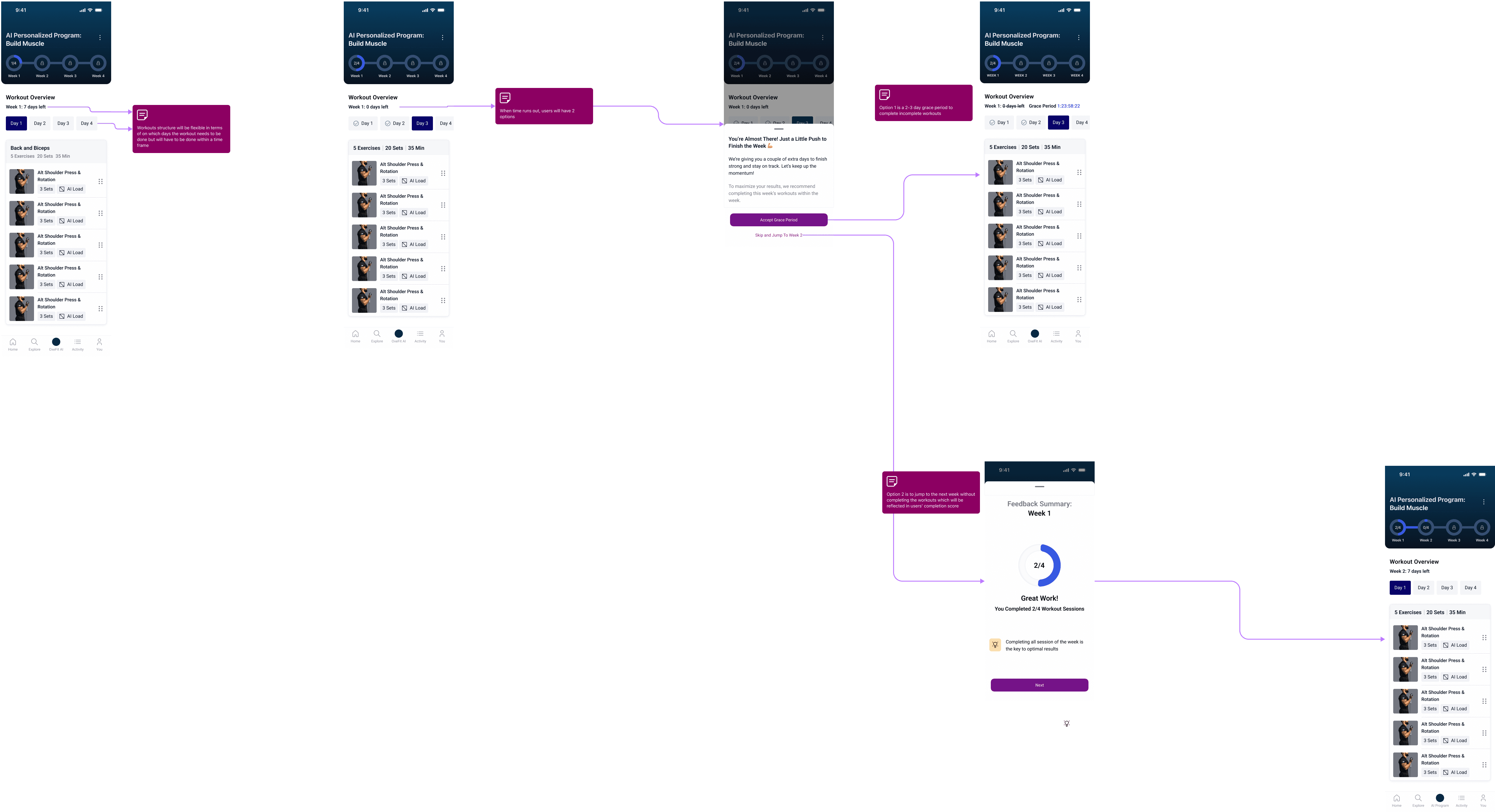
A Major Pivot Occurred in The Product Vision After Presenting The Conceptual Flows…
"I want the AI to be a continouse experience that knows what the user needs on any given day and recommend it — the AI shouldn't have a program structure, that implies that it ends." CEO of OxeFit
This late vision pivot changed many things and without enough time to redo the implemented logic in code, we had to salvage what we've built so far
01.
I proposed a weekly structure to give the feeling of adaptability and continuity.
Since we don't have the time to rewrite our code, I suggested maintaining the weekly structure where AI will be adapting on weekly basis instead of daily


02.
I also proposed contextual AI messages to simulate a sense of intelligence and adaptiveness.
These messages — like ‘Your workout has been adjusted’ or ‘Today’s session is ready’ — helped make the experience feel more interactive and personalized. distracting from the rigid 4-week structure and reinforcing that the AI was truly learning from the user.

I’ve looked into other ways we can adjust our approach to meet the CEO’s vision while still delivering on time
UI and Visual Design
After Iterations and Feedback Rounds, We've Agreed on Some Tradoffs and Moved On to UI and Visual Designs.
Now that we've agreed on the new logic, we've started to explore the visual direction of this new product.
Leadership emphasized having a differentiating UI, something totally unique and simple so we started exploring
After Exploration, collecting feedback, and iterating, we were left with the 3 options below.
Once the visual direction was finalized, I created a dedicated sub-style guide for OxeAI, documented all key components, and tokenized styles to ensure consistency, scalability, and ease of iteration across platforms
As mentioned earlier, OxeAI had to be implemented across three platforms—each with its own inconsistent design system. Given the time constraints, it became clear that the best path forward was to create a new sub-style guide. This allowed OxeAI to maintain a consistent visual identity across platforms, reduce design time, and stand out as a distinguished, standalone product within OxeFit’s ecosystem.


Reflection & What's Next
What I Learned — and What's Next for OxeAI
This project was a deep exercise in product thinking. I wasn’t just designing features — I was shaping a behavior-driven experience
I believe the most valuable takeaway from this project was a reminder that good design isn’t just about usability—it’s about making users care enough to come back. Whether that’s through joy, motivation, or real progress toward a goal, a good product achieves its purpose by creating meaningful reasons to return. Designing OxeAI challenged me to think beyond flows and visuals, and focus on building an experience that drives commitment, reinforces value, and earns trust over time.
System thinking is the shortcut to speed: Creating a dedicated sub-style guide and tokenized components wasn’t just a visual decision—it was about moving faster with fewer mistakes. I learned how much time strong systems save, especially when scaling across teams and platforms.
OxeAI Launches Soon — The Roadmap Starts Here
Collecting performance and behavior data
To understand how users interact with OxeAI and identify engagement patterns, drop-off points, and workout adherence.
Making the AI more adaptive
Using collected data to personalize not just programs—but daily recommendations that reflect user readiness, fatigue, and momentum.
Evolving beyond static protocols
Shifting to a responsive, continuous coaching system that adapts in real time.
Detecting user intent and needs
Building logic that understands when users need to push, recover, or shift focus—based on usage trends and outcomes.
Reinforcing motivation through smarter feedback loops
Iterating on how we frame progress, celebrate consistency, and use insights to keep users committed.
Thanks for reading — I hope this gave you a clear look into my thinking, process, and impact.
I'm always excited to solve meaningful problems through thoughtful design. If you'd like to chat or collaborate, feel free to reach out.

Will You Get Addicted?
Increasing engagement through commitment and gamification.
43%
Increase in engagement
66%
Feature Adoption
End-to-End Design
B2C
IOS Native
Android Native